Little Buddies has a new brand. Here's what changed, what stayed, and why it matters.
When we started Little Buddies, we were a local food waste collection service in Cambridge, picking up buckets from businesses around the Waikato and turning them into something useful. The name made sense. The logo did its job. And we were proud of what we were building.
Businesses evolve. And over the past year, Little Buddies has evolved faster than most.
We're now working with some of New Zealand's most significant organisations — helping them figure out what to do with their organic waste, designing systems on their sites, navigating council consent, and connecting them with the right solutions. We recently signed a contract with one of the largest entities in the region to help them locate, consent, and operate their own composting system. We're in conversations that would have seemed unlikely a few years ago.
The old brand was built for a different version of the business. In collaboration with The Little Acre, it is time to build one that fits where we're actually going.
What changed
The name stays. Little Buddies has traction, recognition, and frankly — a pattern interrupt that works in our favour when Marty walks into a boardroom and introduces himself; the name is disarming. The work does the rest.
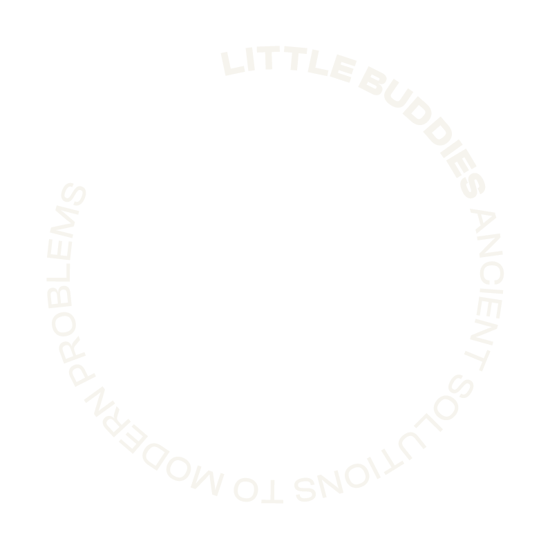
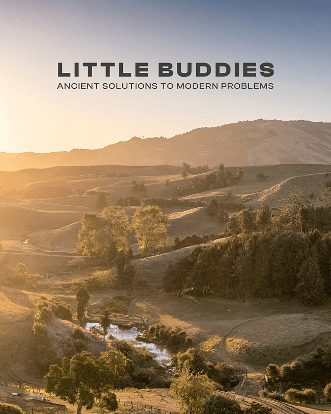
What changed is everything around it. A new logo built on Aktiv Grotesk — clean, confident, utilitarian. A tagline that actually says what we do and why it matters: Ancient solutions to modern problems. A colour palette rooted in the land we work with. And a website that reflects the consulting-led business we're becoming rather than the collection service we started as.
The thinking behind the colours
We didn't want a brand that looked like every other sustainability business — all bright greens and recycling symbols and stock photos of people holding seedlings. That's not who we are.
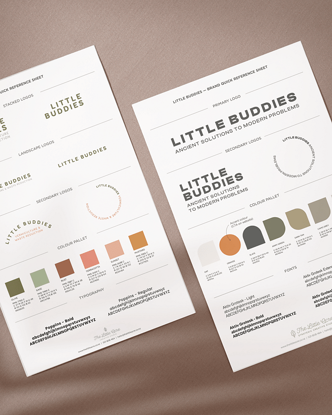
The Little Buddies palette is built from the land itself. Oat and light tan — the pale tones of dry soil and raw grain. Army green — not the fresh, optimistic green of an eco brand, but the darker, more complex green of working farmland in late summer. Dark tan — the colour of earth that's been turned, composted, and brought back to life. Slate — rich, dark soil at depth.
These are the colours of the environments we work in. They feel earned rather than chosen.
And then there's the orange. In any working environment — on a farm, at a processing site, in a field — orange means pay attention. It's the colour of safety. For Little Buddies it carries that same meaning: the safety of the people we work with, the livestock on the land, and the land itself. It also happens to be the colour we use for every call to action on the website, which feels right. Orange says: this is where something happens.
What stays the same
The compost and worms. The knowledge and experience. The commitment to doing this properly rather than just talking about it.
Little Buddies has always been about closing the loop — taking organic waste that would otherwise rot in a landfill and turning it into something the land actually needs. That doesn't change with a new logo. If anything, the new brand just makes it easier to have that conversation in the rooms where the decisions get made.
Ancient solutions to modern problems. We're just getting started.
Interested in what Little Buddies could do for your organisation? Let's talk.